
Unifying to become a powerhouse
Work: US & global brand strategy; full rebrand
Category: Microfinance
Services provided: Brand platform; positioning; name; visual identity system; messaging; voice
Despite decades building the microfinance sector, Accion faced 3 hurdles in creating a direct lending market in the US: low awareness with individual borrowers, fragmented branding, and misconceptions of microfinance as “charity” or “pay day loans”.
It was time to consolidate Accion’s disparate entities and untapped equity under one name, one brand, one idea. The idea had to be economically empowering for borrowers. The execution had to establish Accion and the microfinance sector, as a credible financial service. We not only achieved this in the US, we ultimately extended our work to Accion worldwide, creating the powerhouse brand we know today.
How we did it
…
Brand unification began with the migration of disparate Accion- licensed entities to a single name and masterbrand.
We then integrated the brand architecture, organizing Accion’s offerings by capability (vs. geography or bank partner) to bring its financial expertise into focus.
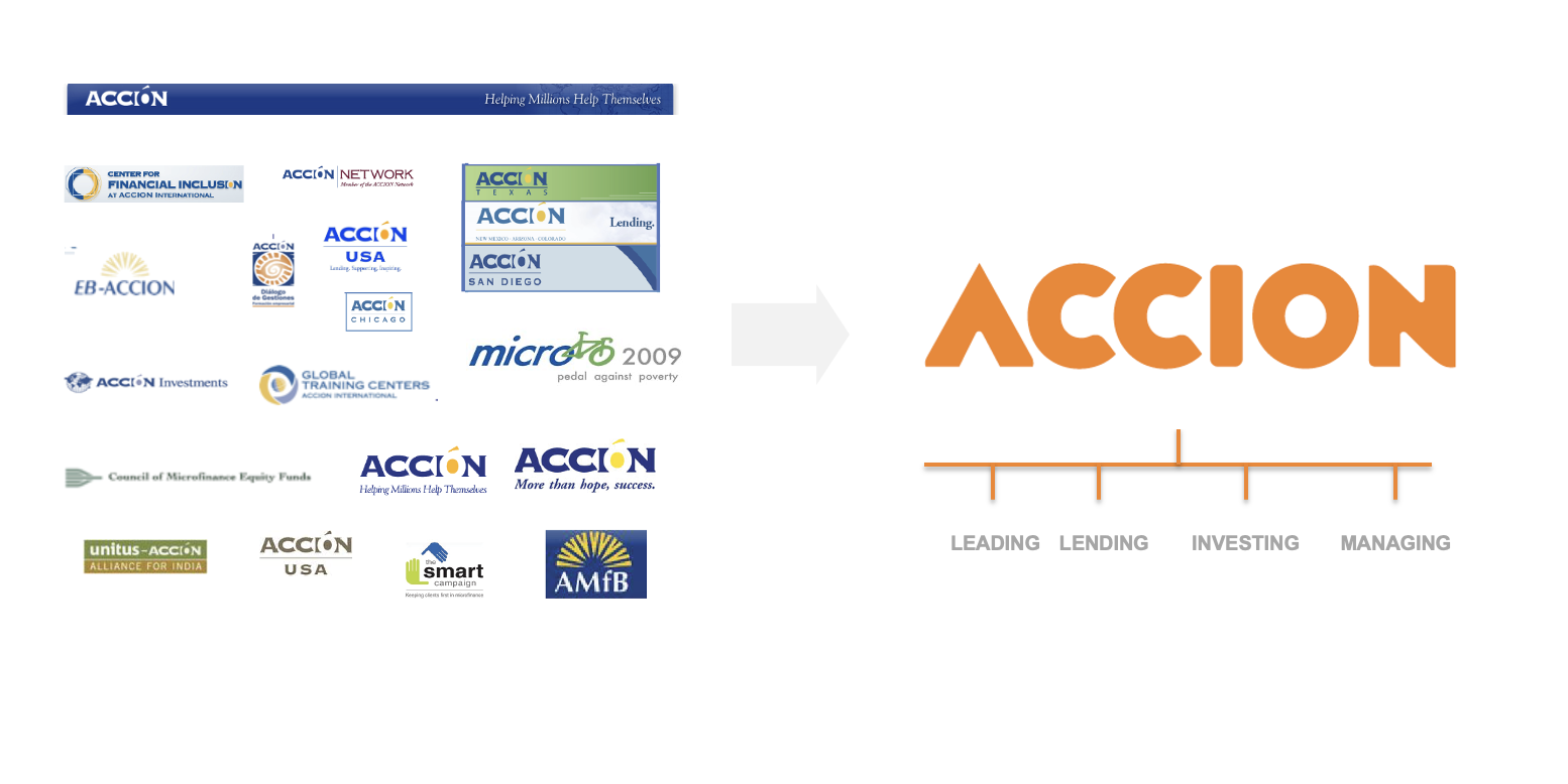
Next, we positioned around a powerful core idea, “Access to opportunity”. As Accion’s reason for being, this idea champions borrower access to financial resources and the opportunities that come from equitable financial inclusion.


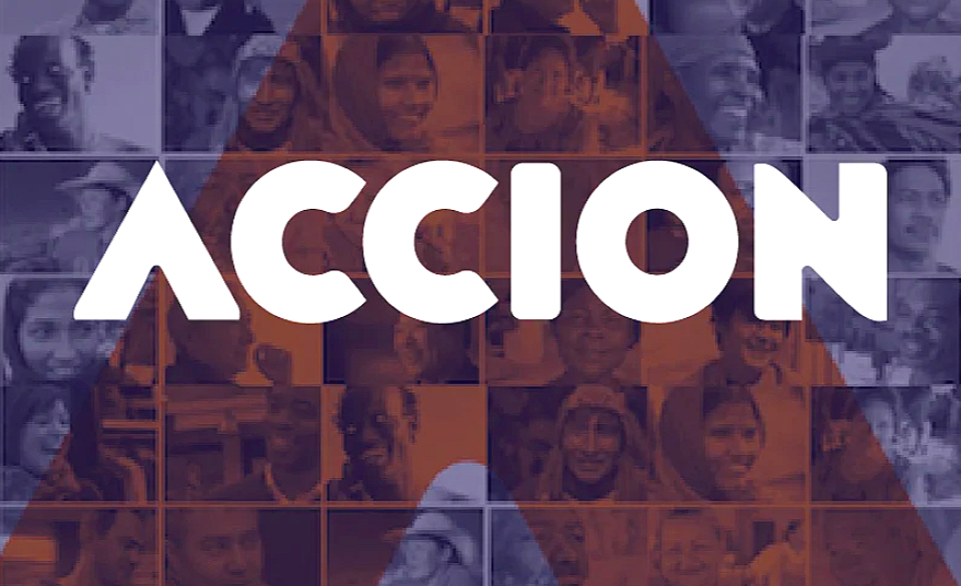
Finally, we developed of a new verbal and visual identity. A bright palette and purposeful messaging create a balance of optimism, credibility and heft.


Logo, symbol, and colors project warmth, credibility and progress.
Messaging welcomes, educates and inspires.
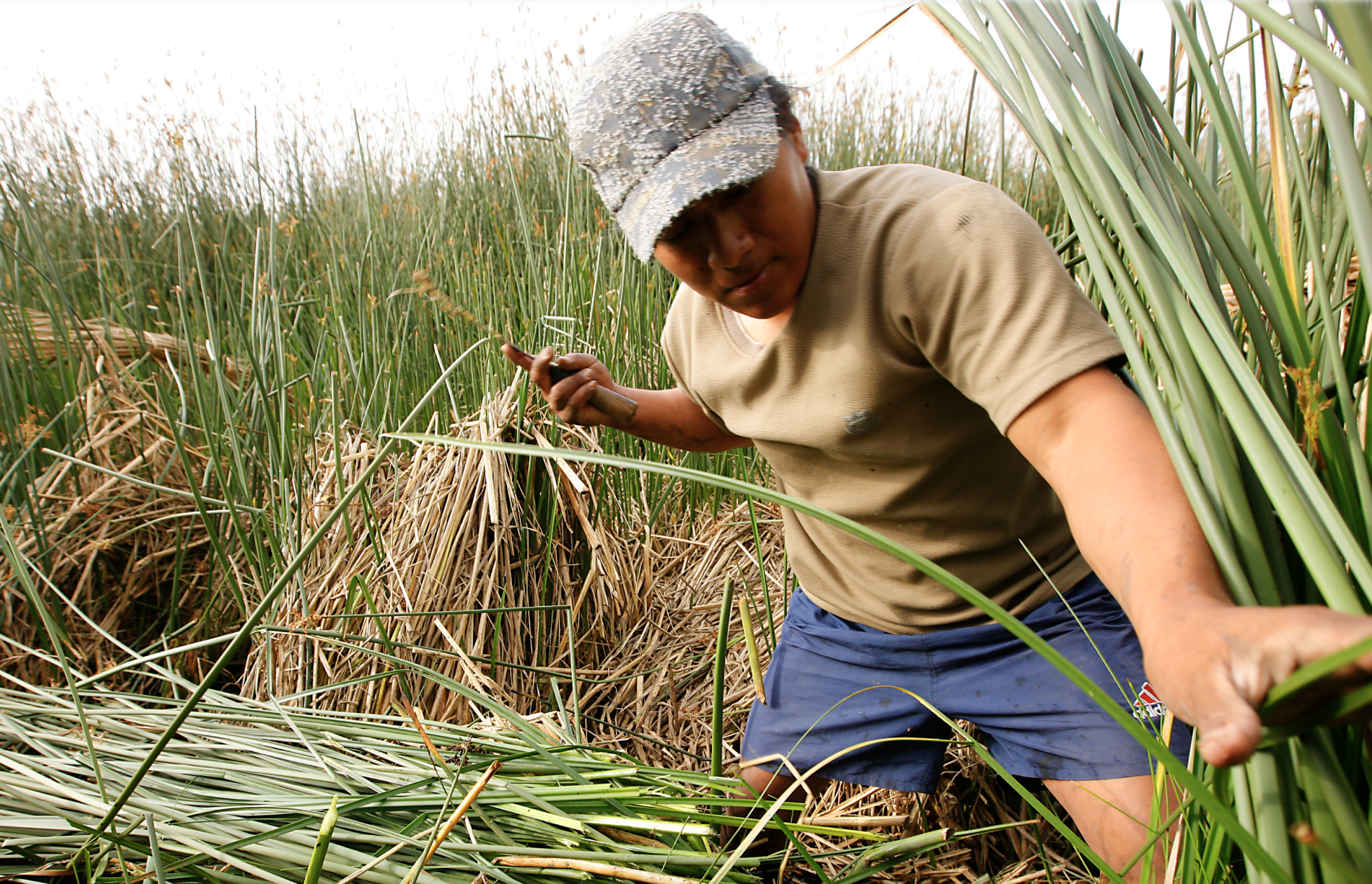
Imagery champions the borrowers (individual micro-business owners) and their role in enriching local communities and economies.
